16 standout brand identity examples from iconic brands like Coca-Cola and Apple. Each brand showcases the power of visual elements like logo design, color, and typography in creating a memorable brand experience. We also provide actionable tips to help you develop your own compelling brand identity.
In a crowded market, a strong brand identity is what makes your business recognizable at a glance and memorable overtime. Beyond just a logo, your brand identity includes the colors, typhography, images, and voice that together tell your story. It shapes first impressions and builds long-term trust.
In this article, we’ll explore 10 standout brand identity examples, from household names to fresh, creative startups. You’ll discover what makes their branding effective and walk away with odes to elevate your own brand presence.
1. What is brand identity?
Brand identity is the visual and emotional language your business uses to communicate with the world. It reflects who you are, what you stand for, and how you want to be perceived. Done well, it creates a cohesive and compelling experience that your audience won’t forget.
Let’s unpack the key building of a powerful brand identity:
1.1 Logo design
Your logo captures your brand’s spirit in a single glance. Take Nike’s swoosh: simple, iconic, and full of energy. It perfectly reflects the brand’s focus on movement and performance.
Keep your logo minimal and flexible, so it works on everything from tiny app icons to massive billboards.
1.2 Color palette
Colors trigger emotion. They set the tone and influence how people feel about your brand. Coca Cola’s iconic red is bold, energetic, and unmistakably cheerful.
Choose a core set of 2-4 colors that align with your brand’s personality and stick with them to create consistency across every touchpoint.
1.3 Typhography
Fonts speak columns. Whether modern, classic, or playful, the typography you choose reinforces your brand’s stone. Google’s clean and modern font communicates innovation and simplicity.
Select one or two readable fonts that match your vibe. Think bold for confidence, rounded for friendlines or serif for tradition.
1.4 Imagery and grabphics
Your visuals breathe life into your brand. Think of Airbnb: its warm, welcoming images of homes and travelers instantly evoke a sense of connection and belonging.
Use images and graphics that reflect your brand’s values and resonate emotionally with your audience.
1.5 Tone of voice and messaging
How you speak is just as important as what you say. Your brand voice, whether it’s bold, witty, calm, or professional, shapes how people connect with you. Mailchimp nails this with its quirky, upbeat messaging that makes marketing feel fun and human.
Define a consistent voice that sounds authentic and speaks your customer’s language.
2. Showcasing exemplary brand identities
Let’s take a look at 16 brands that have nailed their brand identity, each one turning visuals and voice into a magnetic brand experience. From color choice to tone of voice, these brands don’t just look good, they connect, resonate, and stick.
2.1 Glossier
Glossier is a prime example of a brand identity that works effortlessly. With its soft pink palette, minimalist logo, and clean sans-serif fonts, it offers a modern, approachable vibe. The brand uses natural product photography to make beauty feel simple and relatable, creating an authentic connection with its audience.
Glossier’s brand identity is more than just a beauty label. It’s a community. The brand doesn’t just sell products. It builds an experience that feels genuine and accessible. The clean design and suble images help customers feel like they’re part of something real and approachable.
Tips for how to create a compelling brand identity:
- Keep it simple: Use clean, minimal designs to make your brand identity more approachable.
- Focus on the experience: Build a community that feels like home for your customers.
- Stay consistent: Ensure your logo, colors, and tone reflect your brand’s core values.

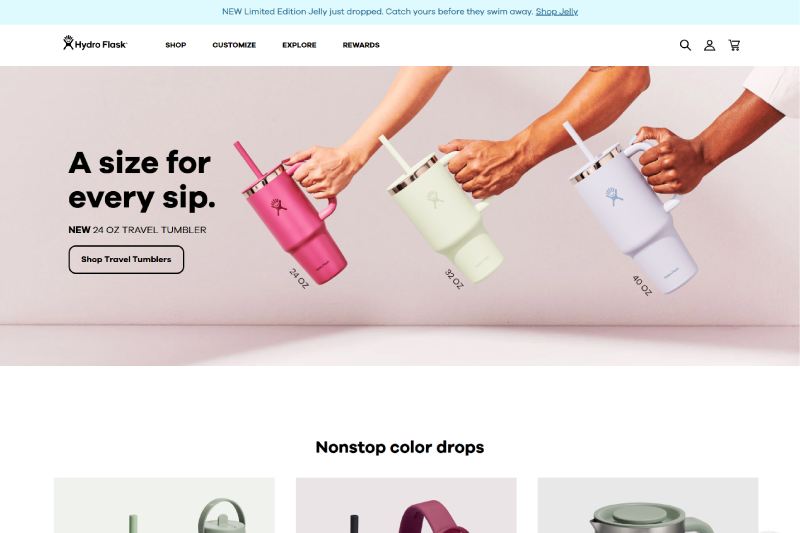
2.2 Hydro Flask
Hydro Flask is a fantastic identity example for brands looking to create a strong visual impact. With bold colors and sleek bottle designs, Hydro Flask captures the spirit of adventure. The mountain-outline logo paired with vibrant outdoor imagery makes the brand feel dynamic and exciting.
Hydro Flask’s brand identity is centered around exploration and the outdoors. The colors and design elements evoke a sense of adventure, appealing to people who love nature and outdoor activities. The brand’s identity not only speaks to functionality but also to a lifestyle, one of freedom, thrill and connection with nature.
Tips for your brand:
- Use energetic colors: Incorporate vibrant hues that match the energy and spirit of your brand.
- Incorporate lifestyle imagery: Align your brand identity with the lifestyle your target audience lives or aspires to.
- Create a sense of adventure: Make sure your brand tells a story, not just about a product but about an experience.
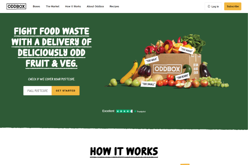
2.3 Oddbox
Oddbox is a standout brand identity example that perfectly merges creativity with sustainability. The quirky illustrations and playful green color palette celebrate “wonky” vegetables, making eco-conscious eating fun and engaging. Their fun, hand-drawn graphics and lighthearted tone stand out in a space often associated with serious environmental issues.
Oddbox’s brand identity design embraces the charm of imperfection. By turning “ugly” produce into heroes, Oddbox has created a visual identity that’s both unique and memorable. Their design not only conveys sustainability but does so in a way that feels joyful, which appeals to a wide audience, especially those looking for an approachable, eco-friendly choice.
Tips for your brand:
- Embrace creativity: Don’t be afraid to step outside the box and use unique visuals, like Oddbox’s playful illustrations, to make your brand identity stand out.
- Leverage color psychology: Choose colors that align with your values and the emotions you want to evoke in your audience. Green, for example, signals sustainability and eco-friendliness.
- Maintain brand consistency: Ensure that your visual elements: logo, color scheme, typography, and messaging are aligned to strengthen brand recognition.
2.4 United sodas of America
United Sodas of America is a creative branding example that combines retro charm with modern flair. The brand’s bright pastel cans and bold logo evoke a sense of nostalgia, while their witty and engaging social media presence keeps it fresh and relevant. This brand identity design stands out for its ability to blend the past and present, creating a memorable and fun brand experience.
United Sodas of America taps into corporate branding with a playful twist. The pastel hues and vintage-inspired design immediately bring back memories of soda from past decades, but the brand keeps things modern with a bold, confident voice. This clever mix makes the brand feel familiar yet fresh, appealing to both older generations and younger audiences who are drawn to its quirky, fun vibe.
Tips for your brand:
- Blend nostalgia with innovation: Mix classic design elements with modern touches to create a memorable and visually appealing brand identity.
- Use bold logos: Your logo should stand out and reflect your brand’s personality. Make it simple yet impactful, like United Sodas of America’s design.
- Engage with your audience: Keep your brand messaging fun and consistent across all channels, just as United Sodas does on social media.

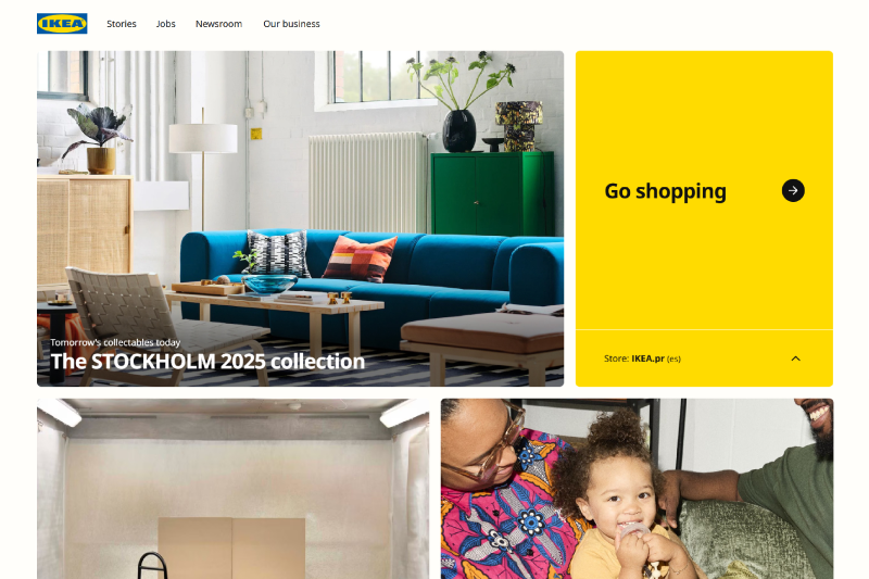
2.5 IKEA
IKEA is a classic brand identity example that masterfully combines functionality with warmth. The brand’s blue and yellow color scheme, along with its clean, minimalistic design, is instantly recognizable. Their approach to corporate branding is consistent across all touchpoints, from product design to store layouts, making it easy for customers to connect with their values of simplicity and affordability.
IKEA’s brand identity design is grounded in the idea that great design doesn’t have to be expensive. The use of bright, inviting colors, blue symbolizing trust and yellow radiating warmth, makes IKEA feel approachable and reliable. The minimalist design style is not just about aesthetics; it’s also about making the shopping experience easy and efficient, reflecting their brand’s commitment to simplicity.
Tips for your brand:
- Simplify the experience: Make sure that your brand identity and customer experience are aligned. A clear, streamlined experience can help customers feel more comfortable and loyal.
- Leverage color psychology: Choose colors that reflect the emotions you want your customers to feel, warmth, trust, or excitement.
- Maintain brand consistency: Ensure that your visual identity is consistent across all platforms, whether online or in-store, just like IKEA does.
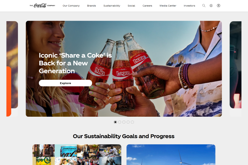
2.6 Coca-Cola
Coca-Cola is one of the most iconic brand identity examples in the world, known for its timeless and instantly recognizable design. The combination of red and white colors, paired with its classic script logo, has become synonymous with joy, celebration, and togetherness. Coca-Cola’s corporate branding focuses on creating an emotional connection with its audience, making it one of the best brand identity examples in terms of global recognition.
Coca-Cola’s brand identity is built on the power of emotion. The red and white color scheme is vibrant, energetic, and evokes feelings of warmth and happiness. The brand’s emphasis on visual storytelling through advertisements and packaging that focus on sharing moments of joy has allowed it to remain relevant and beloved for generations.
Tips for your brand:
- Create an emotional connection: Coca-Cola’s brand identity shows how powerful it can be to connect with your audience on an emotional level. Focus on moments of happiness, community, and shared experiences in your messaging.
- Use color wisely: Like Coca-Cola’s red, choose colors that represent the emotions and values you want to convey to your customers.
- Maintain visual consistency: Ensuring your visual identity, from logo to packaging remains consistent across all platforms to strengthen brand recognitiony
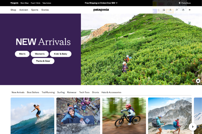
2.7 Patagonia
Patagonia is a standout brand identity example for companies that align their brand with values and sustainability. With its earthy greens and rugged imagery, Patagonia’s brand identity reflects its deep connection to nature and the environment. The logo, combined with simple and authentic storytelling, speaks to eco-conscious adventurers and outdoor enthusiasts around the world.
Patagonia’s brand identity design is built on the idea of responsibility and authenticity. The brand’s visuals and messaging focus on environmental activism and ethical production, which have helped them build a loyal and passionate customer base. This commitment to both sustainability and adventure creates a brand that feels grounded, true to its values, and deeply trusted.
Tips for your brand:
- Stay true to your values: Patagonia’s brand identity is a testament to the power of aligning your brand with meaningful values. Don’t just sell products sell your mission.
- Tell your story: Use visual storytelling to share your journey and your commitment to important causes. Authenticity is key to building trust with your audience.
- Connect with your audience: Focus on building a community of like-minded individuals who share your vision. A strong brand identity
2.8 Spotify
Spotify is a leading brand identity example in the tech and music industry, known for its modern design and dynamic brand voice. The bright green logo and dark interface reflect a contemporary and sleek visual identity, while personalized playlists and curated content enhance the user experience.
Spotify’s brand identity design is rooted in innovation, technology, and music culture. The dark interface combined with vibrant green accents creates a modern, cutting-edge feel. The brand’s use of interactive features and a conversational tone connects directly with music lovers, positioning Spotify as more than just a music streaming service, it’s an experience.
Tips for your brand:
- Use modern design elements: Spotify’s clean, sleek interface and vibrant logo create a fresh, dynamic brand identity. Focus on creating a visually appealing experience that reflects your brand’s innovative edge.
- Personalize the experience: Spotify tailors its content to individual users, building a sense of connection and loyalty. Consider how you can make your brand experience more personalized for your audience.
- Stay connected to your audience: Spotify’s engaging tone and interactive features keep users involved. Ensure that your brand’s communication style resonates with your customers and encourages ongoing engagement.

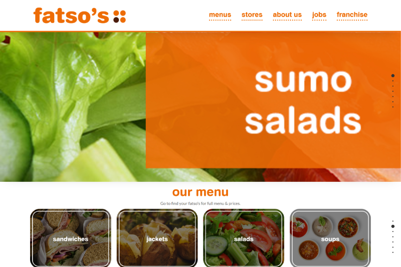
2.9 Fatso
Fatso’s brand identity stands out with its bold, edgy design. The black packaging and gritty typography give the brand a rebellious, fun vibe that appeals to foodies looking for something different. The bold and humorous voice in Fatso’s branding makes it feel authentic and unapologetic, cutting through the traditional, overly polished peanut butter marketing.
Fatso’s brand identity design is unconventional and memorable. The use of dark, stark packaging contrasts with its playful messaging, making it unique in the competitive food space. The bold approach and quirky tone of voice help establish a strong connection with its target audience, creating a brand that feels personal and unfiltered.
Tips for your brand:
- Embrace bold design: Fatso’s edgy packaging and typography make it stand out in the market. Don’t be afraid to use unconventional design elements to make your brand identity memorable.
- Be authentic and unfiltered: Fatso’s rebellious tone makes it feel genuine and approachable. Think about how you can make your brand voice more authentic and relatable to your audience.
- Connect with your niche: Fatso’s branding speaks directly to food lovers and those looking for something unique. Identify and connect with a specific audience that shares your values and interests.
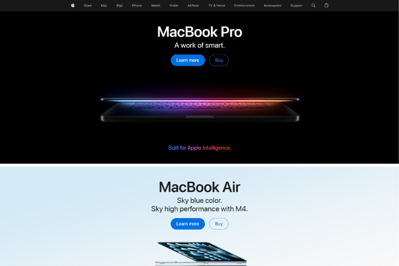
2.10 Apple
Apple is one of the most recognizable brand identity examples in the tech world, known for its sleek, minimalist design and premium feel. The simple silver logo, paired with a clean white palette, conveys sophistication and innovation. Apple’s corporate branding has remained consistent across all products and platforms, creating a unified, instantly recognizable visual identity.
Apple’s brand identity design is centered on simplicity and elegance. The use of clean lines, minimalistic visuals, and polished typography gives the brand a modern, sophisticated look. This design approach reflects Apple’s commitment to innovation, making their products feel intuitive and forward-thinking.
Tips for your brand:
- Embrace simplicity: Apple’s minimalist design is one of the key factors that make its brand identity so strong. Keep your design clean, simple, and focused on the essentials.
- Create a premium feel: Apple’s use of sleek visuals and high-quality materials gives its products a sense of luxury. Think about how you can elevate your brand’s look to convey quality.
- Maintain consistency: Ensure that your visual identity remains consistent across all touchpoints, whether online, in-store, or in marketing materials.
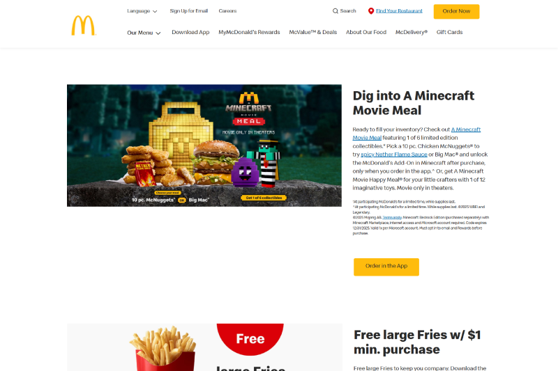
2.11 McDonald’s
McDonald’s is an iconic brand identity example that blends bright colors, playful design, and a strong visual presence. The golden arches, red background, and friendly vibe make it one of the most recognizable brands in the world. The corporate branding is consistent across all marketing materials, from the packaging to the restaurant experience, creating a unified and welcoming atmosphere for customers of all ages.
McDonald’s brand identity design focuses on simplicity and consistency, which has contributed to its long-lasting appeal. The use of bright colors like red and yellow communicates energy, warmth, and happiness, making it instantly recognizable and inviting. McDonald’s also taps into the power of visual storytelling, using its brand elements to evoke a sense of fun and comfort.
Tips for your brand:
- Use bright, engaging colors: McDonald’s red and yellow instantly grab attention and create a welcoming atmosphere. Choose colors that reflect your brand’s personality and evoke the emotions you want your customers to feel.
- Keep it simple and consistent: Consistency is key to building a strong brand identity. Make sure your logo, colors, and messaging are aligned across all channels.
- Appeal to emotions: McDonald’s uses visual storytelling to create feelings of joy and comfort. Think about how your brand can tap into the emotions of your audience and make them feel at home.
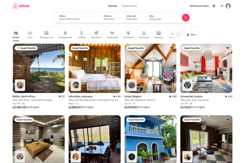
2.12 Airbnb
Airbnb’s brand identity is designed to evoke warmth, trust, and a sense of belonging. The soft coral logo and inviting imagery of homes create a welcoming atmosphere, while the friendly and approachable tone of voice makes the brand feel personal and relatable. Airbnb’s corporate branding emphasizes community and connection, making it stand out in the travel industry.
Airbnb’s brand identity design is centered around the idea of “belonging anywhere.” Their use of welcoming visuals, like cozy homes and happy travelers, reinforces the idea that Airbnb is not just a place to stay—it’s an experience that feels like home. This creates a sense of trust and comfort for travelers.
Tips for your brand:
- Focus on emotional connection: Airbnb’s brand identity is built on creating feelings of warmth and belonging. Think about how your brand can connect emotionally with your audience.
- Use inviting visuals: The use of warm, welcoming images makes Airbnb’s branding feel personal and relatable. Choose visuals that align with the emotions you want to evoke.
- Maintain a friendly tone: Airbnb’s conversational and inclusive voice creates a sense of community. Make sure your brand voice feels approachable and resonates with your target audience.
2.13 Lego
Lego’s brand identity is all about creativity, play, and endless possibilities. The bright red logo and colorful imagery spark imagination, while playful typography adds a fun, childlike element to the brand. Lego’s corporate branding emphasizes learning through play, making it a beloved brand for both kids and adults alike.
Lego’s brand identity design is centered around fun and creativity. The vibrant colors, playful fonts, and interactive elements invite people to build, create, and explore. The brand’s visual identity is designed to inspire imagination and encourage creativity in a way that feels accessible and exciting.
Tips for your brand:
- Encourage creativity: Lego’s brand identity is all about sparking imagination. Think about how your brand can inspire your audience to create, explore, and engage.
- Use playful design elements: Lego’s use of bright colors and fun typography makes the brand feel energetic and playful. Consider how you can inject fun and creativity into your own designs.
- Appeal to both kids and adults: Lego’s universal appeal shows how a brand identity can connect with all ages. Think about how your brand can speak to a wide audience while maintaining a clear, engaging identity.

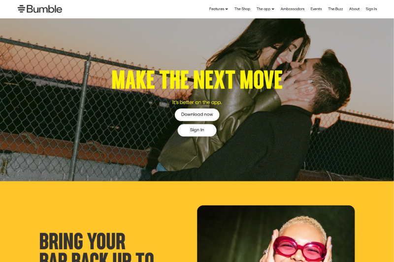
2.14 Bumble
Bumble’s brand identity stands out with its bold, sunny yellow palette and empowering messaging. The logo, paired with an upbeat tone of voice, radiates positivity and inclusivity, making it an appealing option for anyone looking for meaningful connections. Bumble’s corporate branding focuses on empowerment, putting the control back in the hands of women in the dating world.
Bumble’s brand identity design combines modernity with empowerment. The use of yellow not only attracts attention but also conveys warmth and confidence, while playful yet professional typography reflects the brand’s mission of creating a safe, fun space for dating and connections. The brand’s identity emphasizes inclusivity and a sense of belonging.
Tips for your brand:
- Use bold, attention-grabbing colors: Bumble’s sunny yellow is bright, energetic, and welcoming. Choose colors that make your brand stand out and convey the right emotions.
- Empower your audience: Bumble’s messaging is all about empowering individuals. Think about how your brand can make your audience feel strong, confident, and in control.
- Maintain a positive tone: The upbeat tone of voice in Bumble’s branding helps create a fun, approachable atmosphere. Ensure your brand voice is encouraging, friendly, and inclusive.
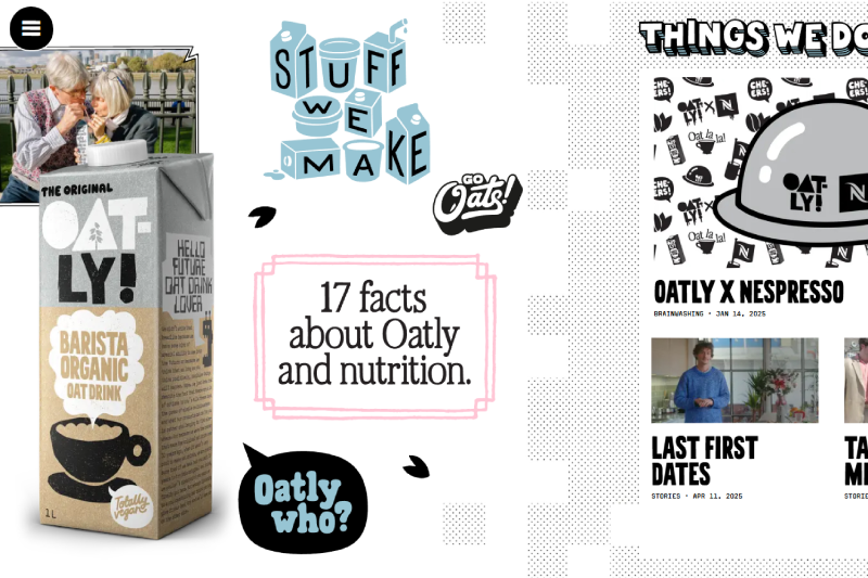
2.15 Oatly
Oatly’s brand identity is quirky, bold, and unapologetic, with its playful blue-and-white cartons and handwritten-style fonts. The brand’s corporate branding is all about standing out from the crowd and challenging the status quo in the food industry. Oatly’s rebellious spirit makes sustainability cool and accessible, giving it a unique position in the market.
Oatly’s brand identity design is characterized by its cheeky tone and minimalist visuals. The hand-drawn fonts and simple, clean packaging give the brand a homemade feel, while its humorous messaging challenges traditional dairy products. This bold, authentic approach makes Oatly feel fresh and relatable.
Tips for your brand:
- Embrace humor and authenticity: Oatly’s cheeky tone and bold design make it stand out in the crowded food industry. Don’t be afraid to use humor and be authentic in your branding.
- Be unapologetic: Oatly’s willingness to challenge conventional norms has helped establish its strong identity. Think about how your brand can differentiate itself and take a stand on important issues.
- Keep it simple: The minimalist design and handwritten fonts give Oatly a personal, approachable feel. Simplify your branding to make a more direct, clear statement.
2.16 GoSELL
GoSELL’s brand identity is vibrant, modern, and full of energy. With its bright purple color palette and sleek logo, GoSELL appeals to entrepreneurs and digital business owners looking for innovative e-commerce solutions. The brand’s corporate branding is focused on providing simple yet powerful tools to help businesses grow in the digital age.
GoSELL’s brand identity design emphasizes innovation and trust. The bold purple color symbolizes creativity and ambition, while the clean, modern logo conveys professionalism and simplicity. This strong visual identity positions GoSELL as a forward-thinking brand that helps businesses stay ahead in the ever-evolving world of e-commerce.
Tips for your brand:
- Use vibrant, bold colors: GoSELL’s purple palette stands out in a sea of traditional branding, making it instantly memorable. Choose colors that reflect your brand’s energy and innovation.
- Focus on simplicity: GoSELL’s design is sleek and modern, making it easy to understand and use. Simplify your brand identity to make it user-friendly and accessible.
- Appeal to your target audience: GoSELL’s branding speaks directly to digital entrepreneurs. Identify your target audience and create a brand identity that resonates with them.

3. Conclusion
If your brand is getting lost in the crowd, it’s time to rethink your identity. A strong brand identity goes beyond just a logo—it’s the connection you build with your audience. Look at brands like Apple, Oatly, and Patagonia. They don’t just have memorable logos; they create real emotional connections through consistent, authentic visuals.
When you focus on what makes your brand unique, stay true to your values, and make sure your identity is consistent, your brand will resonate with customers and stand the test of time. Make sure your brand identity isn’t just something people see—make it something they feel.
Ready to build a brand that stands out? GoSELL offers powerful e-commerce tools to help you create a strong online presence and connect with your audience. Start building your brand today with GoSELL.
4. FAQ
4.1 What are 5 brand identities?
The 5 key components of brand identity typically include:
- Logo design: The visual symbol that represents your brand
- Color palette: The colors you choose to represent your brand’s personality and values.
- Typography: The style of fonts you use to communicate your brand’s tone.
- Imagery and visuals: The photos, illustrations, and design elements that make up your brand’s visual language.
- Brand voice: The tone and language you use in communications, whether friendly, professional, playful, etc.
4.2 What is Coca-Cola’s brand identity?
Coca-Cola’s brand identity revolves around feelings of happiness, nostalgia, and togetherness. It is instantly recognizable with its red and white color scheme and its script logo. The brand focuses on visual storytelling, portraying shared moments of joy and connection. Coca-Cola’s identity has been built over decades and is known for evoking emotional responses that transcend just a beverage, positioning itself as a symbol of celebration and togetherness.
4.3 What are the 5 pillars of brand identity?
The five pillars of brand identity typically include:
- Brand vision: The long-term goal or purpose of the brand, defining what it aims to achieve.
- Brand mission: The core purpose of the brand and how it seeks to achieve its vision.
- Brand values: The principles and beliefs that guide a brand’s actions and decisions.
- Brand positioning: How the brand differentiates itself from competitors in the market.
- Brand personality: The human traits associated with the brand that influence how customers perceive it.