Effective CTAs are essential for boosting conversions in e-commerce, lead generation, or content engagement. 90+ CTA examples across industries, categorized by purpose, with ready-to-use templates for immediate implementation. Avoid common mistakes like generic wording, excessive CTAs, or poor design to optimize performance. Actionable tips and customizable templates help drive engagement, increase conversions, and maximize ROI.

Despite our years of expertise in the marketing field, we are always looking for new and creative call-to-action examples that really speak to us. It ultimately comes down to figuring out the next great way to interact with our audience. A call to action (CTA) is an effective way to prompt website visitors to make purchases, subscribe to a newsletter, or download resources.
We have an analysis that we would love to share with you. HubSpot found that personalized calls to action (CTAs) are more effective than generic ones, performing 202% better. It shows attractive calls to action can result in a high return on investment (ROI).
So, if you’re serious about getting the most out of your website, crafting CTAs is a must. The website should look nice, and the buttons should tell the user what to do next. This is significant for getting more clients to your site and buying things, so you will get more money.
As we said, our marketing experts tested hundreds of CTAs, and now we are revealing them to you.
“Keep scrolling” – This is also a compelling call to action.
1. 90+ call-to-action examples across industries
Here’s a more comprehensive list, categorized by purpose and with industry-specific examples, aiming for that 90+ target:
1.1. E-commerce CTA button examples
Call-to-action examples for e-commerce to boost conversion rates in your online store:
- “Buy now”
- “Checkout”
- “Purchase”
- “Add to Cart”
- “Get %15 OFF”
- “Keep shopping”
- “Shop the latest trends”
- “Today only: Extra savings”
- “New arrivals just dropped!”
- “Your exclusive offer awaits!”
- “Limited edition – Grab yours!”
- “Discover your perfect match”
- “Save more when you bundle!”
- “Find your favorite styles now!”
- “Trending now – Don’t miss out!”
- “Only a few left – Secure yours!”
- “Pre-order now for early access”
- “Unlock your exclusive discount”
- “Claim your deal before it’s gone!”
- “Fast & free shipping – Shop now!”
- “Limited-time flash sale – Act fast!”
1.2. Website CTA button examples
Website call-to-action helps visitors achieve their goals. Website CTAs are the essentials of great user experience and boost conversions as they make the customers desire more information or contact your team.
Here are some compelling CTA examples for websites:
- “Visit our blog”
- “See how it works”
- “Explore our services”
- “Browse our products”
- “Click here to learn more”
- “Your journey begins now”
- “Find the plan that fits you”
- “Discover more”/”Learn more”
- “Unlock premium features now”
- “Let’s grow together – Join now”
- “Start building with confidence”
- “Your dream solution starts here”
- “Exclusive perks await – Sign up”
- “Transform your business with us!”
- “Make it yours – Get started today”
- “Get a live demo – See it in action!”
- “Customize your perfect experience”
- “Explore the future of [your industry]”
- “Discover what’s possible – Click here!”
- “Join the 1,000+ brands succeeding today”
1.3. Lead generation CTA button examples
Lead-generation CTAs are the bait on your hook. Like you’re offering something valuable (a free resource, a discount, or a consultation) for something of value (email addresses, phone numbers, or company information).
Explore some call-to-action examples:
- “Enroll now”
- “Get access”
- “Become a master”
- “Find out how it works”
- “Try it free for 30 days”
- “Unlock your free trial!”
- “Request an instant quote”
- “Start your journey with us”
- “Get your free sample today!”
- “Take our quiz to get started!”
- “Get a personalized plan now!”
- “Free consultation – Book now!”
- “Start your success story today”
- “Discover the best plan for you!”
- “Exclusive access – Sign up now”
- “Join 50,000+ happy subscribers”
- “Let’s build your strategy together”
- “Limited spots available – Register now!”
1.4. Content marketing CTA button examples
You’ve created a fantastic blog post, video, or infographic. Your audience loves it! Now what? Call-to-action in writing provides the answer, leading them to the next step in their journey with your brand.
- “Start reading now”
- “Gain instant insights”
- “Dive into the full story”
- “Discover insider secrets”
- “Level up your knowledge”
- “Unlock expert advice now”
- “Your ultimate guide awaits”
- “Download your free guide!”
- “Watch & Learn – Click here!”
- “Join the conversation today”
- “Explore our success stories”
- “Never miss a post – Subscribe!”
- “Behind the scenes – Learn more!”
- “Exclusive content – Sign up now!”
- “Stay ahead of the game – Subscribe”
1.5. Social media CTA button examples
It could be visiting your site, leaving comments, reacting, commenting, or re-sharing. CTAs are useful to drive your viewers to take the next step in engaging with your brand.
Here are some call-to-action examples:
- “Follow us”
- “Like our page”
- “Join our group”
- “Share this post”
- “Retweet to win”
- “Vote in our poll”
- “Comment below”
- “Connect with us”
- “Pin this for later!”
- “DM us for more info”
- “Engage with us now!”
- “Swipe up for more info!”
- “Double tap if you agree!”
- “Tag a friend who needs this!”
- “Be the first to know – Follow!”
- “Slide into our DMs for details”
- “Your vote counts – Participate!”
- “Follow us for exclusive content”
- “Drop a comment & let us know!”
- “Join the hottest discussion now!”
- “Share this with your community!”
- “Turn on notifications & stay updated!”
- “Watch the magic happen – Click here!”
1.6. Marketing CTA button examples
With marketing calls to action (CTAs), you can direct your audience through the marketing process. You can reach your marketing objectives and boost conversions with this strategy.
Here are some call-to-action examples:
- “Claim your VIP offer today!”
- “Discover what works for you”
- “Custom solutions – Let’s talk!”
- “Refer a friend & earn rewards!”
- “Join our exclusive insider club!”
- “Download the app & get started”
- “Revolutionize your strategy now!”
- “Find the best plan for your needs”
- “Unlock exclusive perks & savings”
- “Get the best deals first – Sign up!”
- “Start scaling your business today!”
- “Get started in minutes – Click here!”
- “Join the thousands growing with us!”
- “Be the first to know – Subscribe now!”
- “Your personalized strategy starts here!”
2. Common mistakes to avoid when crafting a call-to-action
You’re working really hard on your website, creating attractive content, and showing beautiful product images. But your calls to action (CTAs) might not be hitting the mark even with the best intentions. Why? Because some sneaky pitfalls can damage your conversion rates.
Let’s find out what causes problems with CTAs so you can avoid them and increase your sales.
- Employing generic CTAs:
While “Click here” or “Submit” are not incorrect, they often do not drive users and lack clarity of direction. It’s stronger through having specific calls-to-action (CTAs) that make an assertive statement like advantage or urgency.
So try to say, “Begin your free trial” to guide the customers and remind them how they will benefit from involvement; they will get motivated to jump in.
- Ambiguous wording:
Choosing straightforward and brief language in your CTAs significantly impacts user actions.
While expressions like “Learn more” can be effective in specific situations, mainly when space is constrained, or the audience knows your brand well, it’s generally preferable to be clear and direct.
Aim for clarity by designing buttons that explicitly communicate the results of the action. Rather than using unclear prompts, think about expressions such as “Check product details,” “Explore pricing options,” or “Read customer reviews.” These options help users know what to expect, which helps them make a better choice to click.
- Excessive CTAs on one page:
Overusing calls to action (CTAs) on a single page is a typical error. When users see different call-to-action options that conflict with each other, it can confuse them. This confusion may lead to decision fatigue and lower engagement.
To get better results, make your buttons for actions simple and only keep the most important ones. People will find it easy to grasp what to do next in this way.
- Irregular CTA design or positioning:
Your CTAs’ placement and design are crucial to their efficacy. Each CTA (button) must be visually highlighted, so keep them bright, attention-grabbing and interfacing with the page’s design.
Where to put your CTA (s) is important. Place them where users naturally look, usually at the top of the page in the content or at the end of a sub-section.
3. CTA templates and ideas
After learning about common mistakes in creating calls-to-action (CTAs), we will explore templates and ideas to craft high-converting CTAs. A well-made CTA can turn a curious visitor into a paying customer.
Your CTA should be clear, attractive, and create urgency. First, let’s look at the steps to write a compelling CTA.
3.1. Steps to write a compelling CTA
Creating an effective CTA requires strong messaging and strategic placement.
- Use strong action verbs and action-focused messaging: Your CTA must have strong verbs that drive immediate action. Examples include “Get started,” “Claim your offer,” and “Download now.”
- Make it urgent: People engage more when they feel time is limited. Effective call-to-action phrases like “Limited time offer,” “Only a few left,” or “Sale ends soon” push users to act quickly.
- Highlight the value proposition: Show users what they will gain by clicking your CTA. Instead of “Sign up,” say “Sign up & Get 20% off.”
- Keep it concise: Your CTA should be succinct and straight to the point.
A compelling CTA aligns with the user’s intent and fits seamlessly with the surrounding content.
3.2. Call-to-action templates and examples
Below are different types of CTAs you can use, along with customizable templates and best practices:
3.2.1. Direct purchase CTAs
Encourage customers to take immediate action and complete a purchase.
Examples:
- Shop now & Save 20% – Limited time
- Grab yours before it’s gone – Order today
- Buy now, pay later – Interest-free
Templates:
- [Action verb] now & [Offer] (e.g., “Shop now & get free shipping”)
- [Action verb] yours before it’s gone (e.g., “Claim yours before it’s gone”)
- [Action verb] now & pay later (e.g., “Buy now & pay later”)
CTA best practices:
- Use action-oriented language (e.g., “Get,” “Shop,” “Claim”)
- Add urgency or exclusivity (e.g., “Only 3 left in stock”)
- Highlight any discounts or promotions
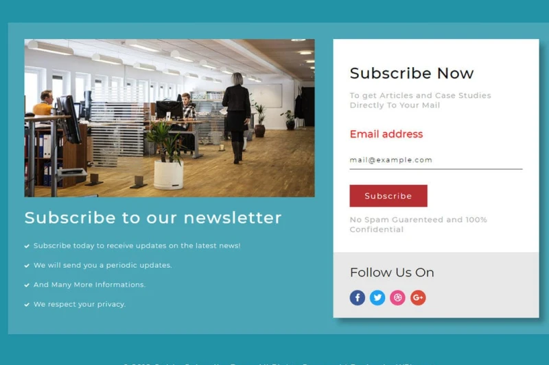
3.2.2. Sign-up and subscription CTAs
Ideal for collecting leads and building customer relationships.
Examples:
- Get your exclusive deal. Sign up for our newsletter
- Subscribe & Get a free gift on your first order
- Join our VIP list and get first dibs on sale items
Templates:
- [Benefit] – [Action verb] now (e.g., “Get exclusive deals – Sign up now”)
- [Action verb] & get a [incentive] (e.g., “Subscribe & get a free gift”)
- Join our [community/group] for [benefit] (e.g., “Join our VIP list for early access”)
CTA best practices:
- Offer an incentive (discounts, free shipping, exclusive content)
- Keep the form short and simple
- Use FOMO (fear of missing out) tactics
3.2.3. Free trial and demo CTAs
Encourage users to try your product or service risk-free.
Examples:
- Try it free for 7 days. No credit card required
- Book a free demo – See it in action
- Start your free trial & cancel anytime
Templates:
- Try [your brand] free for [duration] (e.g., “Try GoSELL free for 3 days”)
- [Action verb] a free demo (e.g., “Claim a free demo”)
- Start your free trial & [benefit] (e.g., “Start your free trial & enjoy ad-free listening”)
CTA best practices:
- Remove friction by making sign-up easy
- Use “No risk” or “No commitment” language
- Highlight key benefits
3.2.4. Social engagement CTAs
Boost social media interactions and user-generated content.
Examples:
- Follow us for daily deals & Giveaways
- Tag us in your photos & Get featured
Templates:
- [Action verb] us for [benefit] (e.g., “Follow us for exclusive content”)
- [Action verb] us in your [content type] & [incentive] (e.g., “Tag us in your photos & win a prize”)
CTA best practices:
- Encourage user participation
- Offer incentives (e.g., feature their content, giveaways)
- Keep it fun and interactive
3.2.5. Urgency and scarcity CTAs
Drive fast action by creating a sense of urgency.
Examples:
- Only a few left – Order before it’s too late
- Flash sales end in 2 hours. Act now
- Last chance! This offer won’t be back
Templates:
- [Urgency phrase] – [Action verb] now (e.g., “Don’t miss out – Shop now”)
- [Scarcity phrase] – [Action verb] before it’s gone (e.g., “Limited stock – Order now”)
- Last chance! [Offer] ends [time/date] (e.g., “Last chance! Sale ends tomorrow”)
CTA best practices:
- Use countdown timers or limited stock indicators
Avoid fake urgency—be genuine - Pair with strong visuals
3.2.6. Checkout optimization CTAs
Reduce cart abandonment and push users to complete their purchases.
Examples:
- Almost there! Complete your checkout now
- Get free shipping – Just one more step
- Don’t miss out – Your cart will expire soon
Templates:
- [Encouraging phrase] – [Action verb] now (e.g., “Almost there! Complete your purchase now”)
- [Benefit] – [Action verb] to finish (e.g., “Get free shipping – Proceed to checkout”)
- Don’t miss out! [Action verb] before it’s too late (e.g., “Don’t miss out! Secure your order now”)
Best practices:
- Simplify the checkout process
- Use reminders (email or pop-ups)
- Offer free shipping or discounts to close the sale
3.2.7. Cross-selling and upselling CTAs
Encourage customers to buy more by suggesting related products.
Examples:
- Complete the look – Add these to your cart
- Buy one, get one 50% off – Shop more & save
- Customers have also bought – Upgrade your order now
Templates:
- [Benefit] – [Action verb] now (e.g., “Complete the look – Shop now”)
- [Offer] – [Action verb] more & save (e.g., “Buy one, get one free – Add to cart”)
- Customers also bought – [Action verb] yours (e.g., “Customers also bought – Upgrade now”)
Best practices:
- Show related or complementary products
- Offer bundle deals or discounts
- Use social proof (e.g., “People love this combo!”)
4. Best practices for CTA implementation
Want more people to actually do something on your website? It’s all about crafting irresistible call-to-actions (CTAs) and ensuring they’re in the right place at the right time.
We’ll show you how to gently place them towards those all-important clicks, boosting user engagement and turning them into customers.
4.1. Optimal placement of CTAs
Placing calls to action (CTAs) strategically is important to grab user attention and encourage clicks. Here are three key areas to position CTAs for maximum impact:
- Above the fold: A CTA button at the top of a page guarantees visibility without needing people to scroll. This works very well for high-priority operations and important landing sites.
- Within relevant content: A call to action statement can be organically included in product descriptions, blog articles, and other interesting material to increase relevancy and click-through rates.
- At the end of the page: When a CTA website prompt is included at the bottom of emails, product pages, or blog posts, consumers are prompted to take action after reading the material.
4.2. A/B testing and optimization
A/B testing for CTAs is essential to determine the best-performing variations. CTA testing involves experimenting with different elements such as:
- Text: Testing different call-to-action ideas, such as “Start Your Free Trial” vs “Get Started Today.”
- Colour and design: CTA design plays a major role in conversion optimization. Testing the button’s colours, shapes, and typefaces will assist in determining which one people like.
- Placement: Testing to see whether a call to action works better at the page’s top, middle, or bottom.
Click-through rates (CTR) and conversion rates are two performance metrics that organizations can practice to optimize their call-to-action (CTA) strategies and increase engagement.
4.3. Mobile-friendly CTA design
Optimizing CTAs for smaller screens is necessary, with mobile traffic dominating online interactions. Consider these mobile-friendly CTA strategies:
- Large, tappable buttons: Ensuring the CTA website button is large enough to be easily clicked on touchscreens.
- Minimal text: Keeping CTA wording short and action-driven (e.g., “Get Started” instead of “Click Here to Learn More”).
- Sticky or floating CTAs: Placing CTAs that remain visible as users scroll improves accessibility on mobile devices.
5. Case studies: Successful CTA campaigns
Leading brands have mastered the art of call-to-action marketing examples, crafting CTAs that drive engagement and conversions.
Let’s analyze some of the most effective ones:
5.1. Amazon: “Buy now with 1-click”
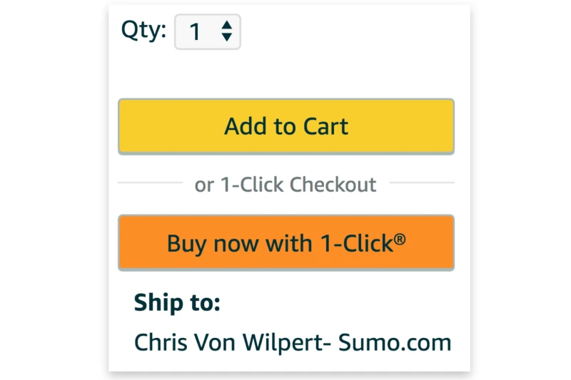
- Why it works: It’s not just about impulse buys, though that’s a by-product. 1-click caters to our desire for convenience and speed, especially for repeat purchases. It’s less of a shout of “BUY NOW!” and more of a gentle nudge of “Buy easily now!”
- CTA placement: Amazon strategically positions this CTA on product pages (especially for frequently purchased items), within the shopping cart, and even in post-purchase emails. It’s about being present where the user is already considering buying. The importance of the call to action (CTA) changes based on the situation. It is more noticeable for repeat purchases.
5.2. Netflix: “Join free for a month”

- Why it works: “Free” is a powerful word. This CTA is a classic risk reversal. Netflix understands that commitment is a barrier. Offering a free trial lets users experience the value before paying, making conversion to a paid subscription much more likely. The product speaks for itself.
- CTA placement: Netflix understands visibility. This CTA is everywhere, from the homepage, landing pages, and social media ads to their app for free trial users. They want to make sure you see it. The design is often bold and eye-catching to grab your attention.
5.3. Dropbox: “Sign up for free”
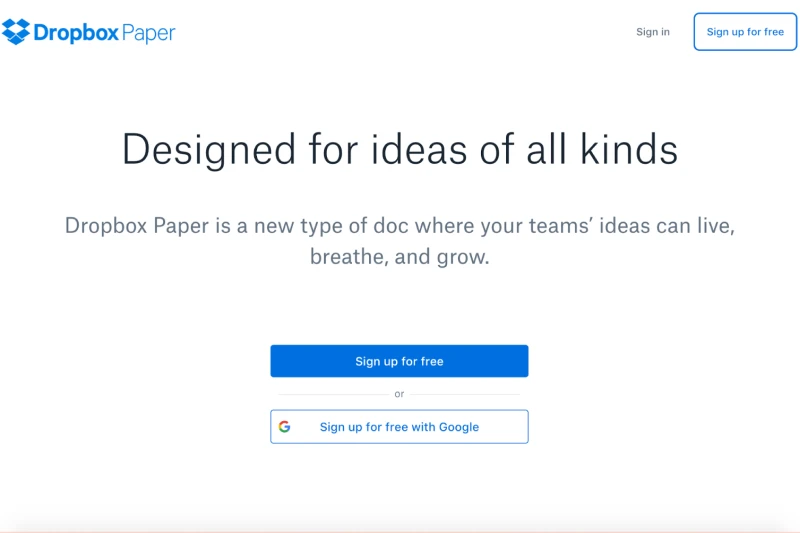
- Why it works: Again, “free” is key. This CTA highlights the no-cost entry, encouraging sign-ups. It subtly hints at a freemium model – try the basics, upgrade later. It’s a low-pressure invitation to explore.
- CTA placement: Dropbox keeps its CTAs clean and straightforward, often prominently placed on its homepage, landing pages, and within the product for free users. They want to focus on the core benefits: easy file storage and sharing.
5.4. Spotify (within the app): “Get Spotify Premium”

- Why it works: This CTA isn’t about getting new users. It’s about monetizing existing ones. It targets users who are already engaged with the free version. They’ve hit the limitations (ads, limited skips) and are now shown the benefits of Premium: ad-free listening, offline downloads, and better audio. It’s about enhancing an existing experience.
- CTA placement: These CTAs live inside the Spotify app. They pop up while listening, browsing playlists, or hitting those free-tier walls. They’re contextually relevant, appearing when you’re most likely to think, “Hmm, maybe I would like ad-free music…”
6. Conclusion
Sales are increased, and engagement is improved by crafting a compelling call to action (CTA).
Here are the main points:
- Place CTAs where they are most visible to encourage interaction.
- Use A/B testing to improve the wording and design of your CTAs for better results.
- Ensure your CTAs are mobile-friendly for smartphone users.
- Look at successful and best call-to-action examples for businesses for inspiration and strategies that work.
- Continuously adjust and test your CTAs to improve your website’s performance and increase conversions.
Businesses can boost sales and engagement significantly and maintain their competitiveness in the online market by investing time in a compelling call-to-action.
7. Frequently asked questions (FAQs)
7.1. What is a call-to-action (CTA) in marketing?
Now, visualize you are taking someone through your website. The CTA is pretty much like, “Hey, once they hit this, this is what they should do next! It could be prodding, a call to action button, or something that must be clicked. Select something like “Sign up”, “Shop now”, or even “Learn more”.
Visitors are persuaded to continue their journey with you by that little prod.
7.2. How to write a compelling call-to-action?
Crafting a high-converting CTA is like whispering the right thing at the right moment. You need three ingredients: clarity, urgency, and value. Use action words like “Get started,” not “Click here.” Highlight a key benefit like “Save 20%,” not just “Buy now.” And make it visually pop. Use contrasting colours and smart placement. It’s impossible to miss.
7.3. What are some common mistakes to avoid when designing CTAs?
Avoid generic phrases like “Click here”; they’re uninspiring. Make sure the context is appropriate for your CTA. Say, “Start your free trial!” if you’re giving away a trial. Additionally, avoid giving visitors too many choices. Keep it focused, and make sure it works on mobile.
7.4. How do I choose the right CTA for my website?
It’s all about knowing your audience and your goals. A product page screams “Buy now,” while a blog post might whisper “Subscribe for more.” Consider what your visitors will likely do next and tailor your CTA accordingly. It’s like anticipating their needs.
7.5. How many CTAs should I have on a page?
Less is often more. One or two primary CTAs are usually enough. A landing page might have one clear call to action, while an e-commerce page could have “Add to cart” and “Save for later.” Don’t confuse your visitors with a million choices.
7.6. How can I track the performance of my CTAs?
Numbers tell the story. Use website analytics to track click-through rates, conversions, and engagement. A/B testing is your friend. Try different versions and see what performs best. Heatmaps and session recordings can show you how users actually interact with your CTAs. It’s like getting real feedback from your visitors.