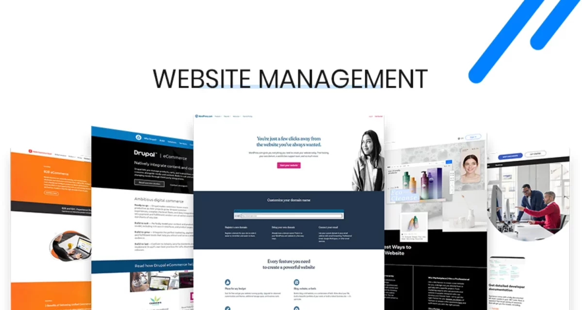
Choosing the right website layout is crucial for creating a seamless user experience and achieving business goals. This guide explores various layout types, including Z-pattern, F-pattern, Fullscreen Image, Split Screen, Asymmetrical, Simple, Magazine, and Horizontal Strips, highlighting their benefits and best use cases to help you make an informed decision.
The layout of a site can essentially make or break your experience therein. Not only is a layout concerned with aesthetics. A good one can change the way you use a site, improve the chances of being listed in search engines, and also steer you toward taking appropriate action, such as making a purchase!
The layout is vital when considering the construction of a new website or redesigning an existing one. ‘User-friendly, appealing, and effective’ are words that describe a site layout. A responsive website layout design plays a major role in making your site design and function properly across all the devices nowadays in a more mobile-first world.
Just like a blueprint for a house: a good blueprint makes a home beautiful, livable, and functional. The opposite terrible one does not end well for anyone.
In this guide, we’ll be your friendly tour guide through some of the most effective website layouts examples for business websites out there. We’ll break down what makes each one tick, highlighting their benefits, and share some practical tips to help you put them into action.
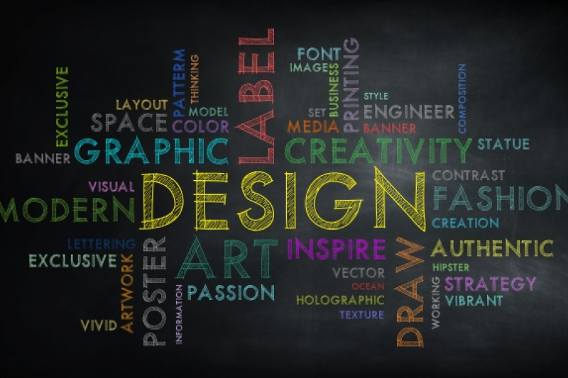
1. Understanding different types of website layouts
Ever landed on a website and just knewyou were in the right place? That feeling usually comes down to a solid website layout. Think about it: Whether you’re a UI/UX designer crafting seamless user experiences, a developer making everything function smoothly, or a business owner trying to build a brand that actually stands out, mastering web design principles isn’t just a “nice-to-know” thing – it’s a must. And hey, even if you’re just someone who geeks out over good design (respect), knowing how different types of website layouts work can change the way you see the web forever.
1.1 Z-pattern website layout
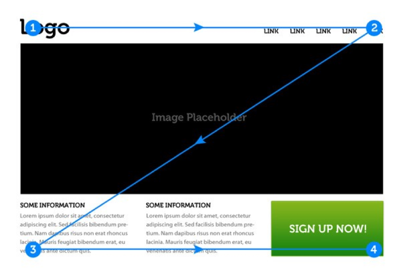
You click on a website. Instantly, your eyes start moving, not randomly, but in a pattern you don’t even realize. Top-left first (maybe there’s a logo or a bold headline), then your gaze glides across to the top-right (navigation, search bar, something useful). Next, your attention drops diagonally across the page, scanning for visuals or key content, before finally landing on the bottom-right where, ideally, there’s a clear call to action waiting for you.
That is the Z-pattern layout in action. It’s how our brains instinctively process information on a screen, making it one of the most effective ways to design a page that guides users without them even realizing it.
You’ve seen this everywhere, on landing pages, digital ads, product pages. Because it just works. It keeps things clean, directs attention naturally, and leads users exactly where they need to go. And once you start noticing it, you won’t be able to unsee it.
The eye naturally follows a Z-shaped path, smart designers position the most critical elements along this flow:
- Top-left → Logo or brand name: This reinforces trust and identity.
- Top-right → Navigation or key links: Helps users quickly find what they need.
- Diagonal sweep → Headline & supporting visuals: This is where the main message should go—a strong value proposition, key benefits, or an eye-catching hero image.
- Bottom-right → The Call-to-Action (CTA): This is the power position—where attention naturally lands and where you want users to take action.
1.2 F-pattern website layout
Unlike the Z-pattern, which works best for minimal layouts, the F-pattern dominates on text-heavy pages like blogs, news sites, and search results.
Here’s how it plays out:
- Top-left → Headline & first few lines: This is where users start reading carefully.
- Horizontal scan → Subheadings or bold text: Eyes move across the top, then drop slightly, skimming for key takeaways.
- Vertical scan → Left-side content: If nothing catches their interest, users scroll down, focusing on the left edge for bullet points, links, or section breaks.
If you’re designing a content-rich page, structure it to match how people actually read:
- Put the most important info in the first few lines
- Use subheadings, bold text, and bullet points to break up content
- Keep CTAs aligned to the left or near key stopping points

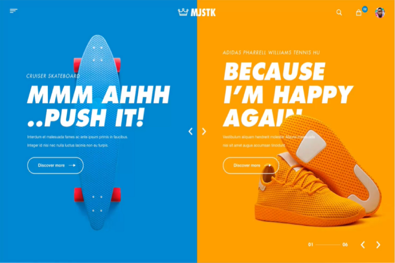
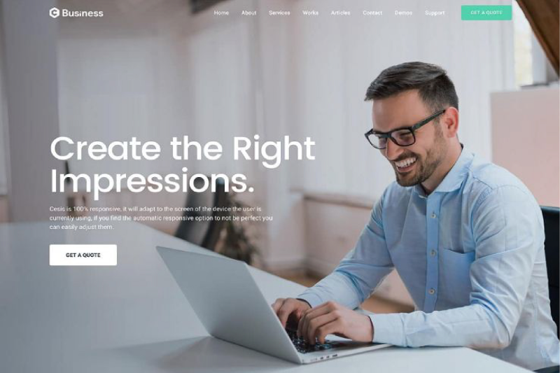
1.3 Fullscreen image layout
Sometimes, words just aren’t enough. A fullscreen hero image that dominates the screen can tell a story, evoke emotion, and instantly capture attention before a single word is read. This layout is a favorite for brands that want to make a bold first impression. It can be showcasing a product, setting a mood or reinforcing a brand identity.
Here’s how they create a powerful first impression:
- Dominating the screen → Instant engagement: A bold, high-quality image grabs attention the moment someone lands on the page.
- Emotional connection → Storytelling without words: Colors, lighting, and composition set the mood, whether it’s luxury, adventure, or innovation.
- Clear focal point → Reinforcing brand identity: Whether it’s a product, a message, or an atmosphere, the image guides the viewer’s perception.

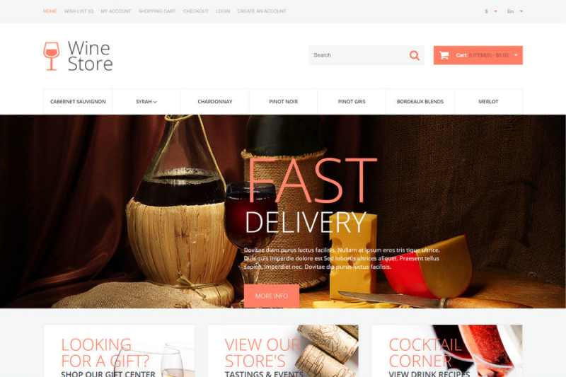
1.4 Split screen layout
Why settle for one message when you can showcase two? The split screen layout divides the screen into two or more sections, making it perfect for contrasting visuals, side-by-side comparisons, or dual messaging.
Why does it work:
- Balanced layout keeps content structured and easy to digest.
- Contrasting elements highlight differences or complement visuals (think: before & after, product A vs. product B).
- Dual focus lets users choose their journey, guiding them toward the right action.
Make it work:
- Use bold typography and strong visuals to create contrast.
- Ensure mobile responsiveness so sections stack seamlessly.
- Pair each side with a clear CTA to drive engagement.
1.5 Asymmetrical website layout:
The asymmetrical layout ditches traditional balance in favor of intentional imbalance, creating a design that feels dynamic and engaging. By strategically placing elements off-center, overlapping, or at varying sizes, this layout adds visual interest, movement, and uniqueness to a page.
Why does it work:
- Creates a sense of energy and unpredictability, keeping users engaged.
- Guides the eye naturally through the content with strategic focal points.
- Breaks up visual monotony, making the site feel modern and innovative.
- Highlight the unconventional arrangement of elements in this layout.
- Discuss its ability to create visual interest and break up monotony.
1.6 Simple website layout
A clean, minimalist layout strips away distractions and lets content shine. By using ample white space, clear typography, and a structured layout, this design keeps things focused, easy to navigate, and visually calming.
Why does it work:
- Improves readability by reducing unnecessary elements.
- Speeds up load time and enhances user experience.
- Creates a polished, professional look that builds trust.
1.7 Magazine layout
Inspired by print magazines, this grid-based layout organizes content into multiple columns, allowing for a structured yet visually engaging design. It’s ideal for sites with lots of information, mixed media, and diverse content types.
Why does it work:
- Provides a clear, organized way to present a variety of content.
- Allows for flexible storytelling with text, images, and multimedia.
- Makes browsing intuitive, especially for content-heavy websites.
- Showcase a grid-based layout with multiple columns and a focus on content.
- Discuss its use for showcasing a variety of information and visuals.

1.8 Horizontal strips layout
The horizontal strip layout arranges content in stacked horizontal sections, often with full-width images, text, or navigation links. This approach works particularly well for websites designed for horizontal scrolling or sections that need clear separation.
Why does it work:
- Creates a smooth, structured way to present different content sections.
- Works seamlessly with horizontal scrolling for a more immersive experience.
- Makes navigation easy by visually breaking content into digestible chunks.
2. Choosing the right website layout for your business
Your website is to create a seamless user experience that will meet your business goals and identity. This is how to choose the right website layout for you:
2.1 Consider your goals and target audience
Before settling on a design, ask yourself: What do you want users to do on your site? This can involve purchasing a product, signing up for a service, or consuming content. This layout should lead them toward that goal. Analyze your business goals and target audience well to determine the most suitable layout for them.
Analyze your business goals and target audience to determine the most suitable layout.
2.2 Focus on user experience
A website is user-friendly if it is easily navigable and engages a visitor. Some key elements that improve the best website layout for user experience include:
- Clear navigation menus help users quickly find information.
- Obvious calls to action (CTA) that drive users towards conversions.
- Clean and uncluttered design that enhances readability and flow.
2.3 Match your brand identity
The layout is an extension of the personality of the brand. A tech company may find a cutting-edge, modern grid layout comfortable, while a flamboyant colorful layout could suit a creative agency well. The right UI/UX design choices will reinforce trust and recognition.
2.4 Ensure a responsive design
Websites are used on many different devices nowadays. Hence, the website layout of your site must be fully responsive. This means the following:
- Optimized viewing across desktop, tablet, and mobile.
- Flexible grids and images just scale with seamless adjustments to the size of the screen for the website.
- Touch-friendly navigation for better mobile usability.
2.5 Test and analyze for continuous improvement
Even in the best layouts, there can be room for improvement. Use:
- A/B testing to find out which design elements are driving engagement.
- Heatmaps and analytics to discover user behavior.
- Feedback loops that collate insights and formulate changes.
3. Tips for designing effective layouts
Beyond any doubt, the website performs a crucial role in affecting user experience and facilities in drumming the actions that you require the visitors to perform. A proper layout allows clarity in appreciation, thereby engaging effectively and permitting easy navigation. This goes on to discuss how to design an effective website layout for optimum usability pertaining to the brand.
3.1 Use a grid system
A grid system instills structure and consistency while assisting in the aesthetic organization of the content before the eye. It seeks to maintain the alignment of elements, thus creating a clean image outwardly. Depending on whether you choose to go with a simple two-column or a more complex multi-column idea, a proper grid keeps the content balanced and easily navigable.
3.2 Maintain white space
Cramped and cluttered pages can create distractions to viewers and make the content difficult to absorb. White space, or negative space, enables viewers to have a visual rest while maintaining a clean and readable layout. Well-designed white space contributes to the readability of a layout while also directing the user’s attention toward salient features, thus increasing the overall pleasure of the browsing experience.
3.3 Prioritize clear typography
Having a proper typography scheme is the backbone of readability and branding. Go with fonts that are legible on all devices so that people have the smoothest reading experience possible. Clear hierarchy-a heading, subheading, and body text-will lead visitors through your content with the utmost ease. Well-picked typography will affirm your brand identity and improve user engagement.
3.4 Use strong visuals
Great images and videos make your site visually attractive and help the site convey its message. They should go hand in hand with your content, compliment your branding, and help direct users to key areas. A balanced layout integrates visuals purposefully, ensuring a greater user experience, not distracting from it.
3.5 Create a strong call to action (CTA)
Your layout should softly usher the user toward any key activity-whether that’s to perform a purchase, sign-up for a newsletter, or ask for other information. Calls to action (CTAs) should be shown in clear contrast, be unambiguously defined in appearance, and positioned on the screen so that they catch the user’s eye. An inviting CTA can tip the scales between mere browsing and conversion.
3.6 Optimize for mobile
Different users check websites on different devices, and therefore, a responsive layout becomes a need. Meaning:
– Optimized for viewing under desktops, tablets, and mobile phones.
– Grids and images are flexible to various screen sizes.
– Touch-friendly navigation promises a hassle-free experience on mobile.
4. Conclusion: The power of layout in web design
Having a well-thought-out website layout engages it for the user experience in a seamless way and the business destination at that. An orderly and intuitive layout permits visitors to easily move through, engage with content, and take the required action, be that making a purchase, signing up, or browsing through your services.
Finding the right layout is not a one-size-fits-all approach. The diversity in experimentation helps to find something for your brand and audience. Testing different structure schemes, visual elements, and even navigation styles improves the opportunity for refinement for enhanced usability and engagement.
Web design is never static. With the changing digital trends, user expectations too change; and the layout has to be modified according to that. Constant performance evaluation, user feedback collection, and changes keep your website functional, up-to-date, and attractive. The best layouts are ones that are designed and constantly refined.
For more insights on building your business online, check out GoSELL to explore how it can help you succeed.
5. FAQ
5.1 What is the most user-friendly website layout?
The most user-friendly layout depends on your website’s purpose and audience. However, Z-pattern and F-pattern layouts are widely considered the best for readability and guiding users through content naturally. A simple website layout with intuitive website navigation and well-placed calls to action (CTAs) also enhances usability.
5.2 How can I choose the right layout for my website?
Consider the factors mentioned in Section III and experiment with different layouts until you find one that works best for you. Think about your target audience, business goals, and user experience needs. You can also take inspiration from the best website layout examples for business websites to see what works for similar industries.
5.3 What are the common mistakes to avoid in website layout design?
Some common mistakes include:
- Cluttered layouts that overwhelm users with too much information.
- Excessive animations that slow down the site and distract from content.
- Poor navigation makes it hard for users to find what they need.
- Ignoring responsive website layout design, which can lead to a bad experience on mobile devices.
5.4 Can I use multiple layout styles on my website?
Yes! You can mix different layouts for different pages or sections of your website. For example:
- A fullscreen image layout for the homepage.
- An F-pattern layout for blog posts.
- A split screen layout for showcasing product comparisons.
- A magazine layout for content-heavy sections.
5.5 How often should I update my website layout?
Regular updates keep your website fresh and engaging. Stay aligned with the latest web design principles and UI/UX design trends. Monitor your website’s performance, user behavior, and feedback, and make adjustments as needed. A major redesign every 2-3 years is recommended, with minor tweaks more frequently.
5.6 Are responsive website layouts essential for mobile users?
Absolutely! A responsive website layout design ensures that your site looks and functions well on all devices, from desktops to smartphones. With the growing number of mobile users, mobile-friendly layouts are no longer optional. They are essential for better user experience, SEO, and conversions.